
The architectural potential of colour
With its focus on inhabitable spaces, architecture as a school understandably focuses on shape, texture and light. But colour is an aspect of design that has great potential to influence the mood of a space’s inhabitants. How can Locker Group help you incorporate colour into your architectural designs?
The importance of colour use in architecture
President of the International Association of Color Consultants/Designers Frank H. Mahnke writes that the goal of colour design in architecture shouldn’t just be decoration.
“Colour is a sensory perception, and as any sensory perception, it has effects that are symbolic, associative, synesthetic, and emotional,” he says.
In the essay ‘Approaches to colour in architecture and design: The discourse of Polychromy/Teaching colour today’ Mette L´orange writes that for decades architecture and interior design have been limited by what she calls ‘chromophobia’ – a refusal to incorporate colours other than the natural hues of the materials used in a project.
L´orange notes that things are changing, though – new technology and materials are driving a renewed interest in architectural use of colour.
Locker Group’s colourful options
Locker Group offers several metal architectural products that can be used to add colour to a design. Beyond the natural tones of the materials themselves, our perforated and expanded metal sheets can be powder-coated with whatever colour you need to complete your design.
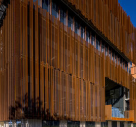
A striking example of how our products can be used in a colour-focussed design is the St. Kilda apartment building ‘The Icon’, designed by architects Jackson Clements Burrows and artist Matthew Johnson. The building is designed to look like an uneven stack of blocks, each of which has its own distinctive colour. The colour use continues into the interior of the building, giving each floor its own distinctive feel.
The Icon is covered in expanded metal screens that have been powder coated in 40 different shades of colour, giving the building a rich and eye-catching presence. Locker Group’s expanded metal serves a dual role as the building’s facade – not only is it visually stunning, but it has the practical benefits of shielding the inhabitants from heat and sunlight.
Matthew Johnson, the artist involved in the collaboration, told The Contemporist that the colour choices represent the geographic and environmental setting of the building, showing the symbolic potential for colour choices in architecture.
Locker Group provide a range of materials that architects can use to explore the design potential of colour, texture and light. To find out more, or discuss how we could help contribute to your next architectural project, please get in touch today.